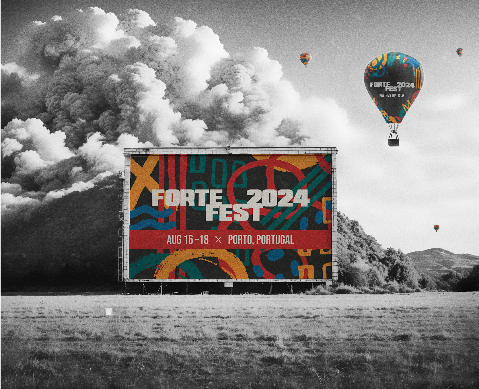
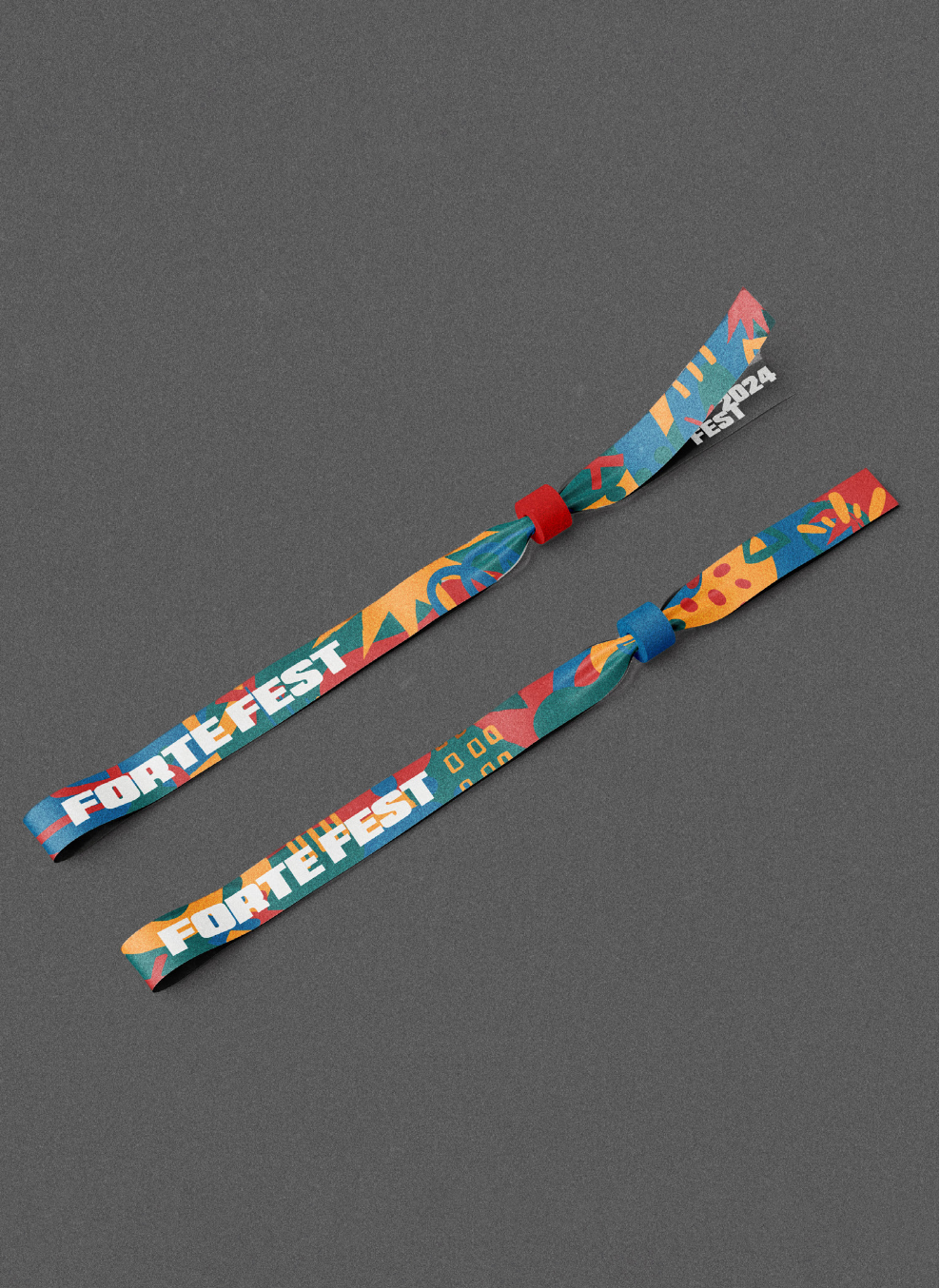
FORTE FEST
Branding & Identity
Art Direction and Design: La Tuttle, Mai Lor, Janet Xiong, Emma Kaiser, Taylor Landfair
The Ask: Create a bold and dynamic visual identity for Forte Fest—a high-energy pop and hip-hop festival that blends global mainstream music with the vibrant spirit of Portugal. The branding should capture the festival’s fearless, vivacious, and boundless energy while appealing to an audience that values culture, music, and adventure.
The Insight: Today’s festival-goers aren’t just looking for concerts—they’re seeking immersive, high-impact experiences that reflect their free-spirited, confident, and socially dynamic lifestyles. Forte Fest should visually embody the thrill of music, travel, and self-expression while staying connected to its Southern European roots.
The Idea: The design direction for Forte Fest is stimulating, confident, and unapologetically bold. The branding will fuse electrifying color palettes, kinetic typography, and dynamic compositions that capture the pulse of live music and nightlife. Abstract patterns inspired by sound waves, movement, and urban landscapes will create a visually striking, high-energy aesthetic. Every design element should feel limitless and unforgettable, mirroring the energy of the festival itself.